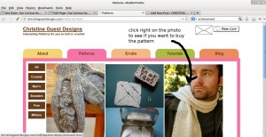
I’m doing a little housekeeping on the website today – I’m going to do my best to make the photos on my patterns page the same size and give them captions so folks know they can just click on the photo and go right to the page about that pattern – I certainly don’t want to make you wait while shopping 😉
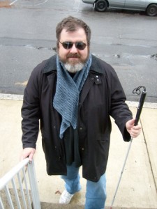
But I’m not sure how long this will take me, I just have to dig out my html/css book and look it up again. I don’t want to use a table, even though that would give me a tidy grid of photos, because that makes it hard for text readers for visually impaired people to process. And who knows? My kid’s godfather might take up knitting, and I REALLY don’t want to get into trouble with him!
I asked some friends from Ravelry to look the site over, and the un-even edges and number of clicks to get to the actual buy something part was a problem. Actually, since last summer, you’ve been able to click on the photo and get right where you can buy it – but that isn’t really obvious. Websites need to be obvious, like well written patterns. Elegant if possible, but clear always. Finished objects should always be elegant, but to get there, you need obvious, clear instructions.
Back to free. I did mention free, right? Yes, the Attleboro Sweater is free now. The company which bought the company which published the Attleboro Sweater in the first place decided to use the re-publication rights they bought to give it away for free.
So, I am too. Which gives you a chance to see how clear, obvious, and occasionally elegant my pattern writing is, even if you aren’t a crocheter. I use the same LaTexa template for both my knitted and crocheted patterns. And I pull clear, obvious and occasionally elegant off because everything I publish has been either tech edited, test knit/crocheted, or both. Then my friend Betsy looks at them.
This may be a one woman show, but it’s not just a one woman show.


