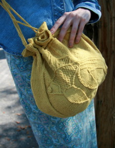
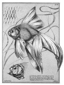
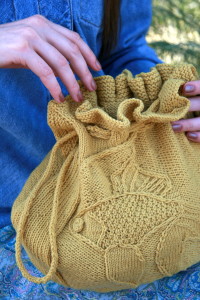
I have a very literal visual aesthetic. Even though I skipped a set of fins, the mouth, and made the double fins single on the fish in my Carp-ette Bag,
- Click here to buy Carpette Bag on Ravelry
- Click here to buy Carpette Bag on lovecrafts with an Affliate Link that gives me extra money
you can see I stuck very closely to the illustration I bought from DoverPictura.


Sometimes I just love to follow a chart exactly and sigh, “It looks so real.” It takes me many, many steps to abstract things, thoughtful simplification is hard work.
I don’t currently draw well enough to begin my own motifs, so I try not to think too hard about what animals and poses I’d like (except for goldfinches in the middle of a bobbing flight, I so want goldfinches in the middle of bobbing flight. There are Batchelor’s Buttons that have gone to seed in my garden that I haven’t pulled up yet because I like to watch the goldfinches eat their seeds – and then fly away to the woods in a bobbing flight.)
When I want to make a motif, I look through sources that have the copyright in a comfy place, and see what cool stuff I can find. The advantage of looking through available drawings over walking in the woods, and then looking for drawings similar to what I just saw – is that I cry less.
Animals in nature twist and preen and move charmingly. In reference books they all have the same pose so it’s easier to identify them. But I’m not trying to identify them, I’m trying to knit them. So if I start from an illustration, I’m charmed by the illustration, not frustrated that it’s not what I had in my head (and can’t draw…yet.) I like drawings better than photographs, because they have already started to become abstracted – and the texture the artist used helps me figure out what texture to use in the knitting. Photos have way too much information.

I have two criteria when I choose a drawing; do I love it and does it have a minimum of horizontal lines? Horizontal lines aren’t a problem for stranded color work, intarisa or knit/purl tapestry, but they are a pain for twist stitch motifs and ring cables.
There is a bit of a stigma for realistic motifs – they were popular in 1980’s knitting, Victorian wallpaper, and 1950’s floral fabrics. None of which are known for refined elegance. Oh well. Placement, proportion and color choices do a lot to curb the kitch, but honestly?
Let’s make some exuberant beauty.
